The world has never been so GREAT.
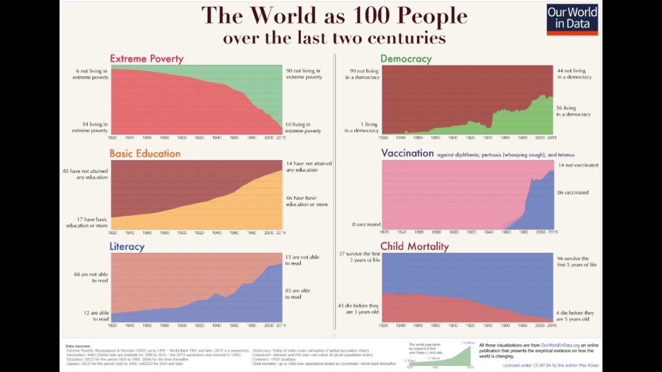
The above charts come from the website The World in Data, and more specifically Max Roser’s piece.
I am sure you have all seen past attempts to represent the world as it is now if it were 100 people.
But tracing that group over 2 centuries achieves something completely different. It really does put our moment in history in perspective, in a manner that has the potential to get us to rethink our fears, our despair, and other things that make things worse when the overall trend is in a positive direction.

Leave a comment